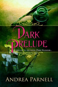
 More observations about Romance covers with the arrival of the cover for the soon to be released Dark Prelude, a prequel to Dark Splendor.
Sometimes there is no clench, no romantically entwined couple at all on the cover. Sometimes elements from the story perfectly capture the mood, tone and setting of the book or story. Add just the right title and just the right shades of color and the impact is magic.
I am taken with the cover for Dark Prelude and am reminded by its effect on me just how much covers matter. Covers likely lead to the first click or the first reach that has a reader looking for more. In a glance there is a sense of what the story is about and a hint of the adventures between the pages.
Dark Prelude is a novella which gives a glimpse into the lives of Silvia Bradstreet and Roman Toller in the weeks before they meet. If Dark Splendor were a movie they would be the scenes on the cutting room floor later added to the director’s cut version of the film or shown as extras on the DVD release. In the case of Dark Prelude, they are the editor’s cuts because of length constraints.
The early chapters might have taken Dark Splendor in a slightly different direction. In Dark Prelude, Roman and Silvia meet a few hours earlier and certainly with a bang. The Dark Prelude cover perfectly captures significant elements of the story I wanted to convey. The quill and ink seal someone’s fate, the sailing ship is a way to escape, intrigue hangs heavy as the fog.
Thanks again to my publisher at TroveBooks.com and Frauke Spanuth at Croco Designs for so amazingly capturing my abstract ideas for the Dark Prelude cover.